-

Bachelor's

-

Masters
-

MBA
-

Doctorate
-

Micro Credit
-

Explore all Courses
-
Postgraduate Certifications

-
Postgraduate Diploma
-
Undergraduate Diploma
-
Diploma


The Psychology of Colours in Digital Advertising

Author: argha chakraborty
|6
MINS READ
| 0
| 1,653
Created On: 09 December, 2025
Share


Table of Contents (TOC):
- Introduction
- Key Takeaways
- What Is Colour Psychology in Digital Advertising?
- How Colours Influence Emotions
- Cultural Differences in Colour Meaning
- How Global Brands Use Colour Psychology
- How to Choose the Best Colours for Your Ads
- Common Colour Mistakes Advertisers Make
- Conclusion
- FAQs
Introduction
Colour comprises 90 percent of the initial impression made by a customer. Studies indicate that individuals make a decision about a product within 90 seconds, and colour influences up to 80 percent of those decisions. With online advertisements, humans decide to either click or not within less than two seconds, and colour acts as a potent tool.
What is Colour Psychology in Digital Advertising?
Colour psychology is the study of the influence of colours on emotions and decision-making. Research indicates that individuals are more likely to be impressed by images than by words, and colour can create immediate first impressions.
Key Takeaways:
- Colour influences up to 80% of consumer decisions in digital environments.
- Different colours trigger distinct emotional and behavioural responses.
- Cultural differences affect how colours are interpreted globally.
- Successful brands maintain consistent colour systems across markets.
- Choosing ad colours is about emotion, clarity, and brand identity, not personal preference.
The Effects of Colours on Emotions
1. Red: Urgency, Excitement, Fast Decision-Making
Red can encourage rapid action and is often used for urgent decisions. It is applied to time-sensitive deals, as tests demonstrate that red increases perceived urgency. Coca-Cola, Netflix, and YouTube use red to convey energy and visibility.
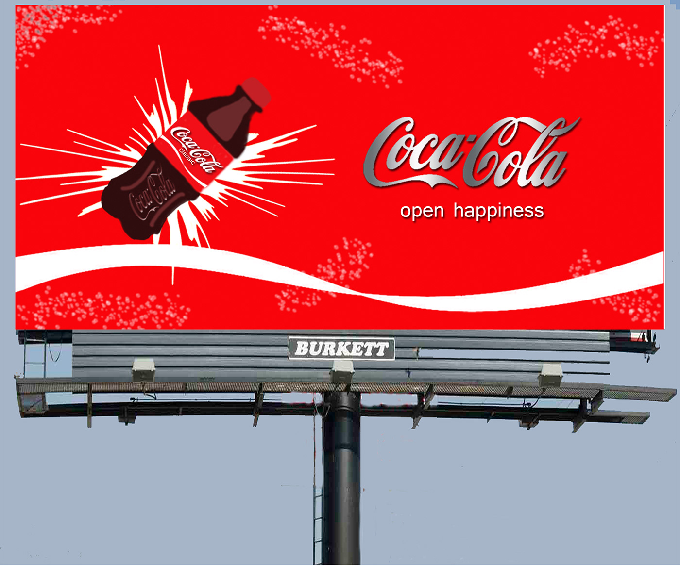
Source: CocaCola
2. Blue: Trust, Calm, Reliability
In general, blue is considered a trustworthy colour in global polls, which explains its usage in many digital platforms. Research indicates that users feel more secure and professional with blue, increasing trust in online interactions, including payments.

Source:Facebook
3. Yellow: Attention, Optimism, Visibility
Yellow is one of the most visually distinctive colours. Eye-tracking research reveals that individuals identify yellow elements significantly faster than grey ones. Many brands use yellow to convey warmth, friendliness, and affordability.
4. Green: Wellness, Harmony, Growth
Green often communicates calmness and safety. Green buttons are frequently tested to be more reassuring than orange, blue, or red, which supports their use in health and eco-focused advertisements. It is also associated with freshness and creativity.
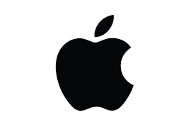
5. Black: Power, Luxury, Exclusivity
Black conveys elegance and premium value. Black backgrounds can draw attention to products in advertisements, and many luxury-oriented brands use black to signal high quality.
Cultural Differences in Colour Meaning
Colours hold different meanings depending on the cultural context. In many Western regions, white represents cleanliness and purity, whereas in parts of East Asia, it connotes mourning. In China, red is associated with good fortune, while in much of Europe, it suggests urgency. Blue is one of the few colours perceived positively across many cultures, making it effective internationally. Global brands often adjust their colour tones to suit local preferences.
Brands such as Coca-Cola, IKEA, Samsung, and Nike tend to switch their colour tones to suit local preferences.
Also Read: The Rise of Influencer Marketing: Strategies for Authentic Brand Promotion
The Use of Colour Psychology in Global Brands
Large brands typically apply colour intentionally, using consistent palettes across platforms.
- Coca-Cola relies on the bright red to be energetic and social.
- Facebook and LinkedIn are painted in blue to create a sense of trust and tranquility.
- McDonald's combines yellow and red to expand hunger and fast clicks.
- IKEA matches blue, which is a color of trust, with yellow, which is a warming colour.
- Luxury and simple style are painted black and white by Apple.
- Spotify brings green to feel like it is fresh, new, and creative.
The colors that Google applies are numerous to be open, diverse, and playful.
These selections are made strategically and applied consistently across websites and apps.
Selecting the Best Colours for Your Ads:
The process of selecting appropriate colours relates to the way people perceive them rather than their aesthetic appeal. Colour shapes emotional responses even before individuals read any text.
Choose the Desired Emotional Response:
Every advertisement aims to evoke a particular emotion, such as immediacy, calm, trust, excitement, luxury, or joy. Colour is one of the most effective ways to achieve this quickly.
Use Colours That Support the Intended Feeling:
Once an emotion has been selected, choose colours that align with it. Greens are suitable for health and nature-focused messages, yellows attract attention to new or playful offerings, and blacks complement luxury or fashion products.
Ensure Sufficient Contrast for Readability:
Design is not solely about aesthetic appeal, but also about usability. Appropriate contrast enhances readability and ensures that calls-to-action are visible and effective.
Maintain Brand Consistency:
Your brand identity should be recognizable through colours alone, even without a logo. Repetition of consistent colours aids recognition.
Adapt Colours for Different Markets:
Colours can carry different meanings in different regions. For example, white signifies purity in the West but can indicate mourning in some Eastern cultures. Red represents good fortune in China but urgency in Europe. Small adjustments in colour tone can make campaigns more culturally appropriate and appealing.
Common Colour Mistakes Advertisers Make
Using Too Many Colours:
Excessive colour variety can overwhelm viewers and obscure the intended message. Successful ads often use one primary colour and one supporting colour.
Poor Contrast:
Insufficient contrast makes text difficult to read, particularly on fast-scrolling social media. High contrast improves readability and draws attention to calls-to-action.
Using Personal Preference Over Audience Needs:
It is important to select colours based on audience perception, not personal taste. Choosing a favourite colour that does not align with the target audience may reduce engagement.
Ignoring Cultural Context:
Colours can have different associations across cultures. For instance, purple may connote wealth in one country and sadness in another. Effective international campaigns adjust colours according to local interpretations.
Inconsistent Colour Usage:
Frequently changing colours can confuse audiences. Consistent use builds recognition and trust, allowing consumers to identify your brand even before seeing the logo.
Also Read: Free Digital Marketing Courses with Certificates
Conclusion
Colours do more than make advertisements visually appealing; they influence attitudes, emotional reactions, and decision-making. Strategically chosen colour palettes help brands convey identity and guide user actions before a single word is read.
FAQs
Q1. Which colour converts best in digital advertising?
A: There is no universal "best" converting colour—it depends on emotion, audience, and context. However, red often boosts urgency, while green frequently performs well for CTAs in health or eco campaigns.
Q2. What colour builds the most trust online?
A: Blue is the most trusted colour globally. That’s why many finance and tech brands use blue in their designs.
Q3. Is it better to use bright or muted colours in ads?
A: Bright colours capture immediate attention, whereas muted colours convey calmness and sophistication. Choices should align with the product and the intended emotional response.
Q4. How many colours should a digital ad use?
A: Ideally two:
- 1 primary colour (emotion driver)
- 1 secondary colour (contrast or support)
Q5. Should I change my brand colours for international markets?
A: Not entirely-but adjusting tones for cultural rules can dramatically improve performance. Many global brands modify shade, contrast, or accent colours by region.
References:
- Institute for Colour Research – General colour psychology overview
https://www.colour.org.uk - “Impact of Colour on Marketing” – Satyendra Singh, Management Decision
https://www.emerald.com/insight/content/doi/10.1108/00251740610673332/full/html - KISSmetrics – Psychology of Colour in Marketing
https://www.kissmetrics.io/blog/psychology-of-color/ - Canva – Colour Psychology Guide
https://www.canva.com/colors/color-meanings/ - HubSpot – CTA Button Colour and Conversion Research
https://blog.hubspot.com/marketing/color-psychology - Neil Patel – How Colours Affect Conversion
https://neilpatel.com/blog/color-psychology/ - EyeQuant Visual Behaviour Research
https://www.eyequant.com/blog - Apple Human Interface Guidelines
https://developer.apple.com/design/human-interface-guidelines/ - Google Brand Guidelines
https://about.google/brand-resource-center/ - Research on Visual Processing Speed
(Adobe / General neuroscience reference)
https://www.sciencedirect.com/topics/psychology/visual-perception - Psychology of Colour in Consumer Behaviour – VerywellMind
https://www.verywellmind.com/color-psychology-2795824
Explore Related Courses


.jpg)


COMMENTS(0)
Explore Related Courses
Our Popular Insights
Careers are shifting faster than ever, and staying relevant takes more than experience. Explore UniAthena’s most-read blogs for sharp insights, emerging skills, and practical pathways that help you move forward with clarity and confidence in a changing professional world.

Best AI Tools for Content Creation
Read More
9
mins read

🌟 Top Project Performer – June 2026 🌟
Read More
1
mins read


🌟 Top Project Performer – May 2026 🌟
Read More
1
mins read


Best AI Tools for Content Creation
Read more
9
mins read
🌟 Top Project Performer – June 2026 🌟
Read more
1
mins read
🌟 Top Project Performer – May 2026 🌟
Read more
1
mins read
Get in Touch

It’s Time to Start
Join NowMost Popular Online Specialization
- Master of International Business Administration
- Master of Business Administration
- MBA in General Management- FastTrack
- Master in Innovation and Entrepreneurship
- MBA-Family Business Management
- Master in Procurement and Contract Management
- Extended Diploma in Business Analytics (SCQF Level 11)
- Diploma in Supply Chain and Logistics Management (SCQF Level 11)
- Strategic Human Resource Management Practitioner
- Master in Data Science
- Master in Engineering Management
Trending Online
- Integrated Doctorate of Business Administration
- Postgraduate Certificate in Finance for Next Generation Managers
- Master of Business Administration- General Management (Fast Track)
- Postgraduate Certificate in Socio-Economic and Legal Framework
- Postgraduate Certificate in Business Sustainability
- Certified Manager
- Supply Chain Management Practitioner
- MBA - AI in Business
- MBA - Accounting & Finance
- Master in Supply Chain and Logistics Management
Top Universities Online Certificates
- Postgraduate Certificate in International Marketing Management
- Postgraduate Certificate In International Human Resource Management
- Postgraduate Certificate in Strategic Management
- Postgraduate Certificate in Procurement & Contracts Management
- Postgraduate Certificate in Business Analytics
- Postgraduate Certificate in Strategic Supply Chain & Logistics Management
- Postgraduate Certificate in Human Resource and Leadership
- Project Management Practitioner
- Postgraduate Certificate in Supply Chain Design & Implementation
- Postgraduate Certificate in Management Accounting and Finance
Accredited Online Degree Program
- MBA - Digital Transformation
- MBA - Family Business Management
- MBA - Marketing Management
- MBA in Quality Management
- MBA - Business Intelligence & Data Analytics
- MBA in Operations & Project Management
- MBA in Energy Management
- MBA In Construction & Safety Management
- Master in Organisational Leadership
- Master in Public Health
- Master in Construction Management
- Bachelor of Arts in Business Administration


UniAthena is an Ed-Tech, offering flexible, affordable learning solutions, including Free-Learning Upskilling Courses and Academic Programs in partnerships with accredited and globally renowned universities and professional qualification bodies.


Do you have any questions ?
Feel free to send us your questions or request a free consultation
Send a messageUK
Athena Global Education
Magdalen Centre,
Robert Robinson Avenue,
Oxford, OX4 4GA, UK
Phone : 01865 784299
MIDDLE EAST
Athena Global Education FZE
Block L-03, First Floor,
P O Box 519265, Sharjah Publishing City,
Free Zone, Sharjah, UAE
Phone : +971 55 879 5492
INDIA
Uniathena Private Limited
9A,Midas Tower
Phase 1
Hinjewadi Rajiv Gandhi Infotech Park
Pune-411057
Phone: +91 9145665544
All Copyrights Reserved @ Athena Global Education 2021-2026