-

Bachelor's

-

Masters
-

MBA
-

Doctorate
-

Micro Credit
-

Explore all Courses
-
Postgraduate Certifications

-
Postgraduate Diploma
-
Undergraduate Diploma
-
Diploma


From Raw Data to Real Insight: How Visual Tools Change Everything

Author: neha mondal
|5
MINS READ
| 0
| 96
Created On: 07 April, 2026
Share


Table of Contents (TOC):
- What Is Raw Data and Why Does It Need Processing?
- What Visual Data Processing Tools Do
- How Alteryx Software Fits Into This Workflow
- Visual Data Analysis Techniques in Practice
- Conclusion
Frankly, when was the last day you didn’t hear the word “data”? Chances are, it was just yesterday. Your phone tracks your steps. Your bank monitors your expenditure. Your manager requires information for each decision. Even your food delivery application knows what you are going to order before you do.
Data is everywhere. Unstructured, unorganised data, however, has limited value in its original form. Somebody has to clean it, structure it, and prepare it before it can provide meaningful insight.
Now, here is the point: hundreds of tools are made precisely to do this. Millions of rows of data can be processed using tools that automate repetitive tasks and present workflows visually. A few professionals are familiar with some of these tools, but many are still evaluating where to begin. Many hesitate due to uncertainty around tools and workflows.
We have chosen one of these tools as a reference in this blog to guide you on how this entire process works, what to anticipate, how the steps relate to each other, and what the output would be like. Most of these tools think the same way. The logic and steps are similar. So once you understand the flow in one, you will find the others much less intimidating.
What Is Raw Data and Why Does It Need Processing?
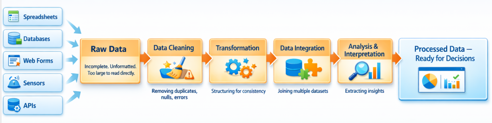
Raw data refers to information gathered from various sources such as spreadsheets, databases, web forms, sensors, or APIs. In its original form, this data is usually incomplete, irregularly formatted, or simply too large to be read as such. Raw data analysis techniques typically involve several steps:
- Data collection from one or more sources
- Cleaning to remove duplicates, nulls, and formatting errors
- Transformation and structuring for consistency
- Joining multiple datasets through data integration techniques
- Analysis and data interpretation to extract insights
The challenge has traditionally been that these steps required coding knowledge (SQL, Python, R). Visual data processing platforms change this by representing each step as a visual component in a workflow.
What Visual Data Processing Tools Do
Visual data analysis tools allow users to build data pipelines using a drag-and-drop interface. Instead of writing code, the user connects visual blocks, each representing a specific operation like filtering rows, joining tables, or calculating new fields. The data flows through these blocks step by step, and users can preview results at each stage.
This approach to data processing makes it easier to:
- Understand what is happening to data at each step
- Quickly test and adjust transformations
- Share workflows with team members who may not code
- Automate repetitive data tasks without scripts
How Alteryx Software Fits Into This Workflow
Alteryx software is one example of a visual data processing platform used for data analytics, data preparation, and automation. It is used in this blog as a practical reference to understand how these types of tools function in real scenarios.
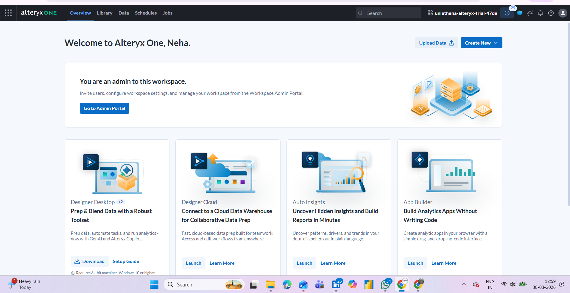
The platform provides a canvas-based interface where users build workflows by connecting tools. Below is a breakdown of how the core feature categories map to common data processing tasks:
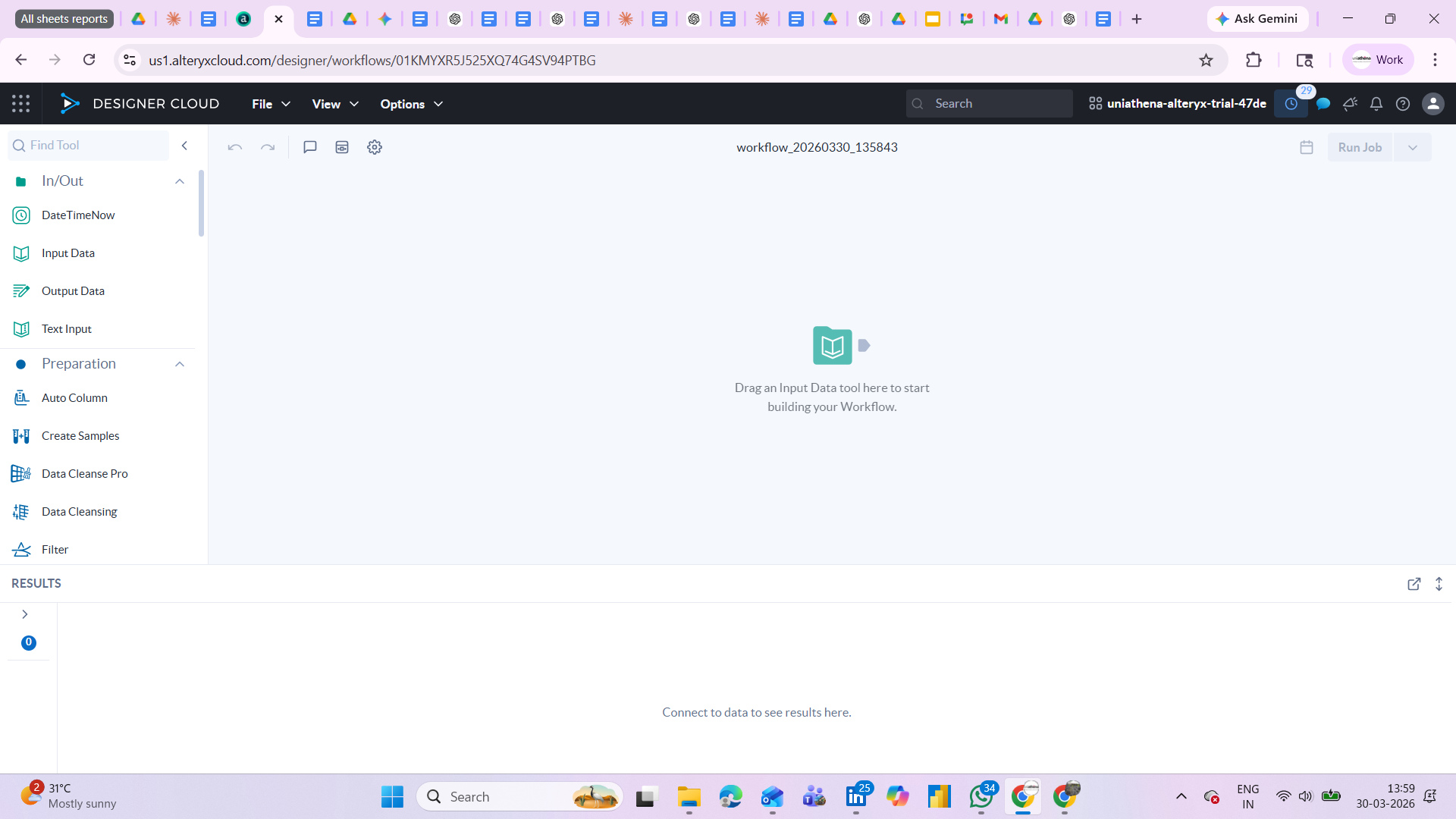
Fig.: Main workspace of Alteryx
Connecting to Data Sources
The Input Data tool allows users to connect to Excel files, CSVs, databases, and cloud sources. The Output Data tool saves the processed result back to a chosen format. These two tools form the start and end of almost every workflow, making data integration techniques accessible without SQL or API knowledge.
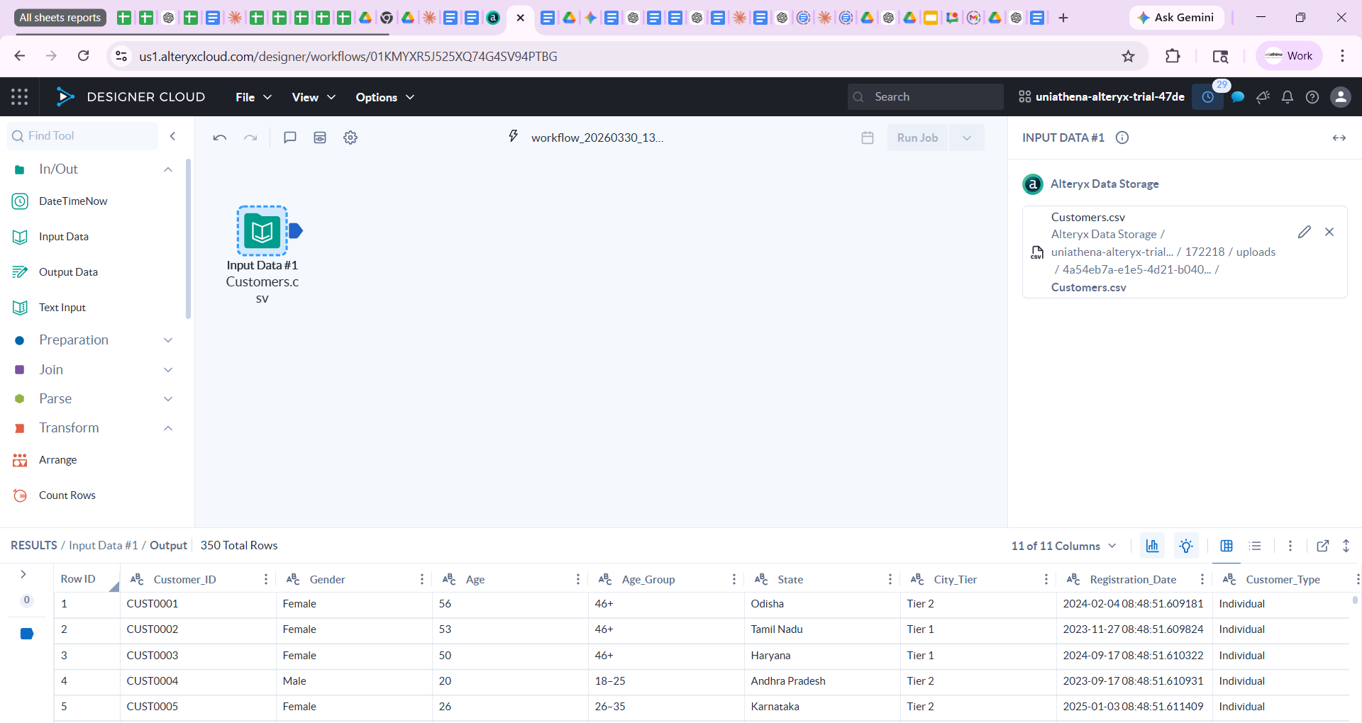
Fig.: Input data widget
Cleaning and Preparing Data
The Preparation tool category covers the most common steps in raw data analysis, removing nulls, renaming columns, filtering rows by condition, sorting, and selecting only relevant fields. For example, the Filter tool lets you set a condition (e.g., "Region = North") to keep only matching rows. The Formula tool lets you create calculated columns using expressions similar to Excel formulas.
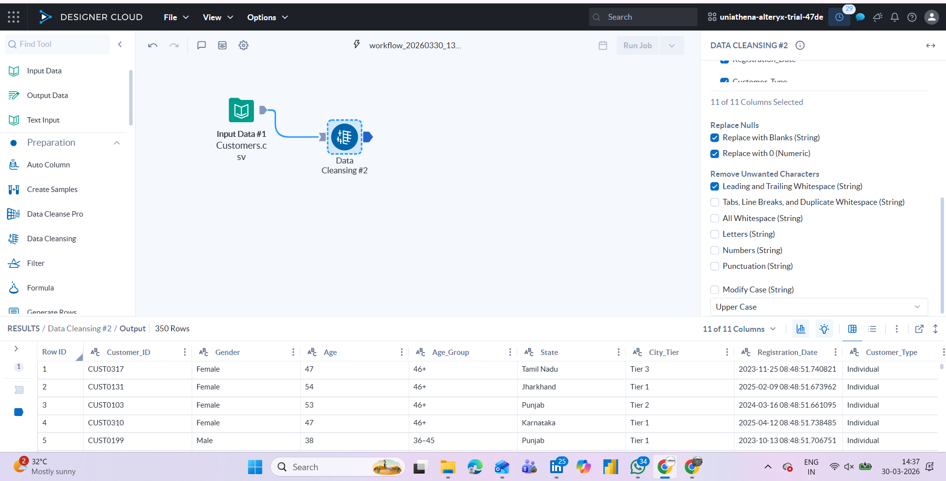
Fig.: data-cleaning widget
Combining Multiple Datasets
The Join tool merges two datasets based on a common field, similar to a VLOOKUP in Excel or a JOIN in SQL, but without writing any query. This is particularly useful in cloud data processing scenarios where data comes from different systems and needs to be unified before analysis.
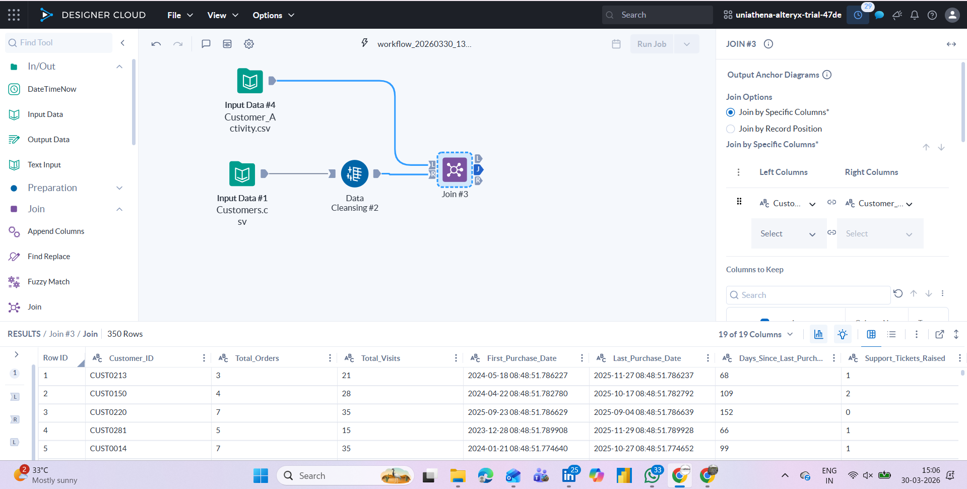
Fig: joining two dataset widgets
Summarising and Aggregating
The Summarise tool groups data and applies aggregations, count, sum, average, min, max, by category. This is one of the most commonly used steps in data interpretation workflows, helping reduce large datasets into structured summary tables that can feed into reports or dashboards.
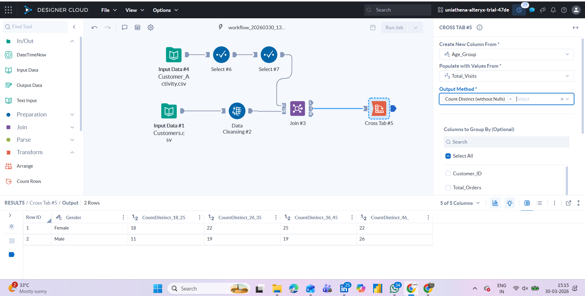
Fig: Pivot data/cross-tab table widget
Also Read: Is Python Necessary for Data Analysis?
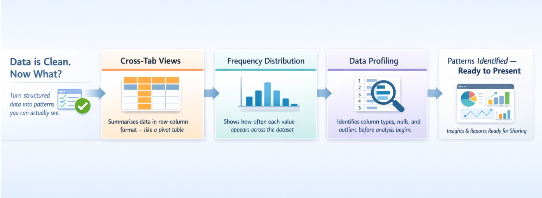
Visual Data Analysis Techniques in Practice
Once data is cleaned and structured, the next step is interpretation. Visual data analysis techniques focus on presenting data in charts, graphs, or summary views that make patterns easier to identify.
Some tools in this category include:
- Cross-tab views that summarise data in row-column format (similar to a pivot table)
- Frequency distributions to see how values are spread
- Data profiling to understand column types, nulls, and outliers before processing begins
These visual data analysis techniques are typically applied after the core data prep steps, allowing analysts to validate their outputs and communicate findings more clearly to stakeholders.
Also Read: Data Consolidation Simplified
Conclusion
Visual data processing tools simplify one of the most complex stages of analytics: transforming initial datasets into usable, structured insights. By converting technical steps into visual workflows, these platforms enable analysts to clean, transform, integrate, and summarise data efficiently without relying on code.
Platforms such as Alteryx provide a practical framework for understanding these workflows. From ingestion to analysis-ready output, the stages outlined in this blog reflect standard data processing practices across tools and industries.
Rather than viewing tools as the starting point, the real shift lies in developing a structured approach to working with data. Familiarity with workflows, logic, and interpretation ultimately defines analytical capability more than any single platform.
Learning resources and certifications can support this journey, but the long-term value comes from consistent hands-on engagement with real datasets and problem-solving scenarios.
Explore Related Courses


.jpg)

COMMENTS(0)
Explore Related Courses
Our Popular Insights
Careers are shifting faster than ever, and staying relevant takes more than experience. Explore UniAthena’s most-read blogs for sharp insights, emerging skills, and practical pathways that help you move forward with clarity and confidence in a changing professional world.


What is Health and Safety Management?
Read More
7
mins read

🌟 Top Project Performer – April 2026 🌟
Read More
1
mins read

What is Environmental Governance?
Read More
7
mins read


Most In-Demand Skills in Guyana
Read More
8
mins read

What is Health and Safety Management?
Read more
7
mins read
🌟 Top Project Performer – April 2026 🌟
Read more
1
mins read
What is Environmental Governance?
Read more
7
mins read
Most In-Demand Skills in Guyana
Read more
8
mins read
Get in Touch

It’s Time to Start
Join NowMost Popular Online Specialization
- Master of International Business Administration
- Master of Business Administration
- MBA in General Management- FastTrack
- Master in Innovation and Entrepreneurship
- MBA-Family Business Management
- Master in Procurement and Contract Management
- Extended Diploma in Business Analytics (SCQF Level 11)
- Diploma in Supply Chain and Logistics Management (SCQF Level 11)
- Strategic Human Resource Management Practitioner
- Master in Data Science
- Master in Engineering Management
Trending Online
- Integrated Doctorate of Business Administration
- Postgraduate Certificate in Finance for Next Generation Managers
- Master of Business Administration- General Management (Fast Track)
- Postgraduate Certificate in Socio-Economic and Legal Framework
- Postgraduate Certificate in Business Sustainability
- Certified Manager
- Supply Chain Management Practitioner
- MBA - AI in Business
- MBA - Accounting & Finance
- Master in Supply Chain and Logistics Management
Top Universities Online Certificates
- Postgraduate Certificate in International Marketing Management
- Postgraduate Certificate In International Human Resource Management
- Postgraduate Certificate in Strategic Management
- Postgraduate Certificate in Procurement & Contracts Management
- Postgraduate Certificate in Business Analytics
- Postgraduate Certificate in Strategic Supply Chain & Logistics Management
- Postgraduate Certificate in Human Resource and Leadership
- Project Management Practitioner
- Postgraduate Certificate in Supply Chain Design & Implementation
- Postgraduate Certificate in Management Accounting and Finance
Accredited Online Degree Program
- MBA - Digital Transformation
- MBA - Family Business Management
- MBA - Marketing Management
- MBA in Quality Management
- MBA - Business Intelligence & Data Analytics
- MBA in Operations & Project Management
- MBA in Energy Management
- MBA In Construction & Safety Management
- Master in Organisational Leadership
- Master in Public Health
- Master in Construction Management
- Bachelor of Arts in Business Administration


UniAthena is an Ed-Tech, offering flexible, affordable learning solutions, including Free-Learning Upskilling Courses and Academic Programs in partnerships with accredited and globally renowned universities and professional qualification bodies.


Do you have any questions ?
Feel free to send us your questions or request a free consultation
Send a messageUK
Athena Global Education
Magdalen Centre,
Robert Robinson Avenue,
Oxford, OX4 4GA, UK
Phone : 01865 784299
MIDDLE EAST
Athena Global Education FZE
Block L-03, First Floor,
P O Box 519265, Sharjah Publishing City,
Free Zone, Sharjah, UAE
Phone : +971 55 879 5492
INDIA
Uniathena Private Limited
9A,Midas Tower
Phase 1
Hinjewadi Rajiv Gandhi Infotech Park
Pune-411057
Phone: +91 9145665544
All Copyrights Reserved @ Athena Global Education 2021-2026